Color vs. Black-and-White E-Readers in 2026: Which Display Technology Wins?
As color e-ink reaches the mainstream, traditional black-and-white screens are fighting back with sharper contrast. Here is how the two display technologies trade off on battery, clarity, and reading experience.
By Factlen Editorial Team
- Monochrome Purists
- Argue that reading devices should prioritize the sharpest possible text, highest contrast, and longest battery life over visual gimmicks.
- Color Adopters
- Value the versatility of color for book covers, highlighting, graphic novels, and document annotation.
- Productivity Power Users
- Focus on open Android ecosystems and large-format color screens for academic and professional productivity.
What's not represented
- · Library administrators managing digital lending
- · Manga and comic book artists
Why this matters
Upgrading an e-reader is no longer a simple choice of ecosystem. Choosing between a color and monochrome screen dictates how long your battery lasts, how crisp your text appears, and whether your eyes fatigue during long reading sessions.
Key points
- Color e-readers use Kaleido 3 technology to display up to 4,096 colors, ideal for comics and covers.
- Monochrome screens using Carta 1300 panels offer superior contrast, brighter backgrounds, and faster page turns.
- Color screens feature a filter layer that inherently darkens the display, requiring higher front-light usage.
- Battery life on monochrome devices can last weeks longer than on comparable color models.
For years, the digital reading experience was defined by a single aesthetic: stark black text on a pale grey background. But in 2026, the e-reader landscape has fractured into two distinct camps. The arrival of mature color e-ink technology has transformed devices from simple text renderers into vibrant digital canvases. Yet, traditional monochrome displays have not quietly retired; instead, they have doubled down on optical clarity and speed. Upgrading an e-reader is no longer just a matter of picking an ecosystem like Amazon or Kobo. It now requires a fundamental choice between the versatility of color and the uncompromising sharpness of black and white.[1][2]
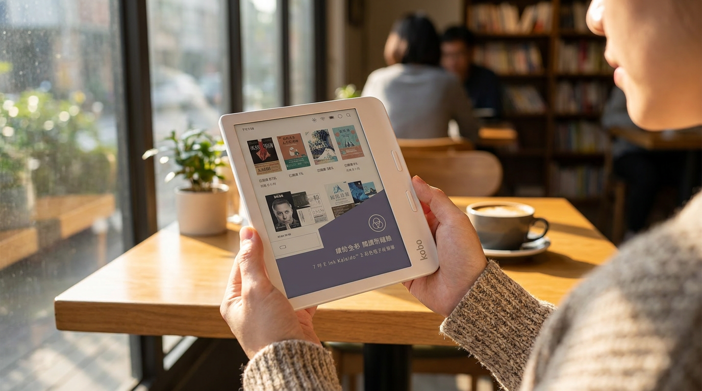
The catalyst for this market shift is the widespread adoption of E-Ink Kaleido 3 technology. Devices like the Kobo Libra Colour, the Amazon Kindle Colorsoft, and various Android-powered Boox tablets have brought color out of the niche enthusiast market and into the mainstream. These screens promise to bring book covers to life, make graphic novels readable, and allow for color-coded annotations. However, traditional monochrome displays have simultaneously advanced. The latest E-Ink Carta 1300 panels, found in the 2026 Kindle Paperwhite and Kobo Clara BW, offer unprecedented contrast and page-turn speeds that older generations simply cannot match.[1][3][6]
The core technological difference between the two formats dictates their respective strengths and weaknesses. Monochrome screens utilize microscopic capsules filled with black and white pigments that rise to the surface when an electrical charge is applied. Color e-ink, specifically the Kaleido 3 standard, achieves its hues by placing a Color Filter Array directly over that standard black-and-white backplane. This physical filter layer is the source of every major trade-off in the color versus monochrome debate, altering how light interacts with the screen and how crisp the underlying text appears to the human eye.[1][4]

When evaluating traditional black-and-white e-readers, the argument for them centers entirely on pure reading comfort and optical clarity. Because there is no color filter sitting between the e-ink capsules and the reader's eyes, the background appears lighter and the text appears significantly darker. The argument against monochrome screens is their sheer lack of versatility; they reduce vibrant magazine layouts, complex academic charts, and colorful book covers to muddy, greyscale approximations. The evidence for monochrome superiority lies in the raw specifications: modern black-and-white screens deliver a flawless 300 pixels per inch (ppi) resolution across all content, providing a reading experience that is virtually indistinguishable from high-quality printed paper.[3][5]
Conversely, the argument for color e-readers is that digital reading should not be confined to plain text. The ability to view content exactly as the publisher intended adds a layer of immersion that monochrome devices lack. The argument against color e-ink is the inherent optical compromise caused by the filter layer. Without the front light turned on, color screens appear noticeably darker and greyer than their monochrome counterparts, often requiring constant illumination. The evidence here is also quantifiable: while black text on a color screen remains at 300 ppi, the color elements themselves render at a halved resolution of 150 ppi, resulting in a softer, slightly pixelated look that resembles vintage newspaper comics rather than a glossy iPad screen.[4][5]
Conversely, the argument for color e-readers is that digital reading should not be confined to plain text.
Beyond visual clarity, the two technologies diverge sharply in performance and battery life, which remains a critical factor for frequent travelers. Monochrome devices require fewer full-screen refreshes, resulting in faster page turns and minimal ghosting—the faint outline of previous text remaining on the screen. Because they reflect ambient light so effectively, they rarely require high front-light settings during the day, relying instead on the natural brightness of the room. This operational efficiency allows devices like the standard Kindle Paperwhite or Kobo Clara BW to measure their battery life in weeks or even months, providing a truly frictionless reading experience.[3][4]
Color devices must work considerably harder. Rendering mixed media and clearing color pigments from the screen requires heavier refresh cycles, which can occasionally interrupt the reading flow with a brief screen flash. Furthermore, because the color filter inherently darkens the display, users typically run the front light at much higher intensities to achieve a comfortable white background. This increased power draw means that color e-readers, while still vastly outperforming traditional LCD tablets, often see their battery life reduced by 20 to 30 percent compared to their monochrome siblings.[2][3]

The software ecosystems surrounding these screens also play a role in the decision. Closed ecosystems like Amazon's Kindle prioritize a streamlined, distraction-free reading experience, making their monochrome devices incredibly stable. Open Android e-readers, such as those from Bigme and Boox, lean heavily into color technology because it enables users to download third-party productivity apps, browse the web, and highlight documents in multiple colors. Kobo sits in the middle, offering both color and monochrome options with native support for library borrowing and stylus annotation, proving that color can be useful even outside of a full tablet operating system.[5][6]
Ultimately, there is no single winner in the 2026 e-reader market; the right choice depends entirely on a user's specific habits and visual sensitivities. A traditional black-and-white e-reader fits well when your primary diet consists of text-heavy novels, biographies, and narrative nonfiction. It is the ideal tool for readers who prefer to read outdoors in direct sunlight, those who are highly sensitive to screen contrast, and anyone who wants to leave their charger in a drawer for weeks at a time.[1][2]
However, a monochrome device does not fit well when you frequently consume graphic novels, manga, or heavily illustrated children's books. It is also a poor choice for students and professionals who rely on color-coded highlights to organize their notes, or for readers who simply find greyscale book covers uninspiring and difficult to browse. For these users, the stark clarity of black and white becomes a rigid limitation rather than a feature, turning complex charts and vibrant artwork into an unreadable wash of grey tones.[4][5]

A color e-reader fits well when you want a versatile digital canvas that bridges the gap between a dedicated reading device and a multipurpose tablet. It is perfect for visual learners, comic book enthusiasts, and anyone who heavily annotates PDFs and academic papers. The muted, pastel-like colors of Kaleido 3 screens offer a charming, eye-friendly alternative to the harsh glare of an iPad or smartphone, making long study sessions significantly more comfortable.[3][5]
Conversely, a color e-reader does not fit well when you demand the absolute sharpest text possible or if you prefer reading with the device's front light completely turned off. If the idea of a slightly grey background or a visible screen door effect bothers you, the added novelty of color will not outweigh the loss of pure typographic contrast. In 2026, the choice is clear: prioritize the pristine clarity of the written word, or embrace the vibrant, slightly softer world of color.[4]
How we got here
2007
Amazon launches the first Kindle, establishing monochrome e-ink as the standard for digital reading.
2020
Early color e-ink devices hit the market, but suffer from poor contrast and slow refresh rates.
2024
Kobo releases the Libra Colour, bringing the improved Kaleido 3 color technology to the mainstream consumer market.
2026
Both color and monochrome technologies reach maturity, forcing consumers to choose between ultimate contrast and visual versatility.
Viewpoints in depth
Monochrome Purists
Argue that reading devices should prioritize the sharpest possible text, highest contrast, and longest battery life over visual gimmicks.
This camp believes that the primary purpose of an e-reader is to replicate the experience of reading a physical paperback book as closely as possible. They point out that the addition of a color filter array fundamentally compromises this goal by darkening the screen and reducing the crispness of the background. For readers who consume text-heavy novels, biographies, and essays, the monochrome purists argue that any sacrifice in contrast is unacceptable, regardless of how nice a color book cover might look in the library menu. Furthermore, they emphasize the practical benefits of monochrome technology. Devices without color filters require significantly less power, allowing readers to go weeks or even months without charging. By eliminating the need for high front-light settings and heavy screen refreshes, monochrome e-readers remain the undisputed champions of distraction-free, long-form reading.
Color Adopters
Value the versatility of color for book covers, highlighting, graphic novels, and document annotation.
Color adopters argue that digital reading has evolved beyond plain text, and e-readers must evolve with it. They highlight that a vast amount of published content—from comic books and manga to children's literature and academic textbooks—relies heavily on color to convey information and emotion. Stripping this content down to greyscale, they argue, provides an inferior and sometimes unreadable experience. The introduction of Kaleido 3 technology allows these readers to enjoy mixed media on an eye-friendly display that doesn't cause the fatigue associated with traditional LCD tablets. Additionally, this camp values the interactive elements that color enables. The ability to highlight text in multiple colors, draw diagrams in margins, and organize notes visually transforms the e-reader from a passive consumption device into an active study tool. For these users, the slight reduction in base contrast is a small price to pay for a vastly more capable device.
Productivity Power Users
Focus on open Android ecosystems and large-format color screens for academic and professional productivity.
This perspective looks past the traditional Amazon and Kobo ecosystems, focusing instead on open Android devices from manufacturers like Boox and Bigme. For productivity power users, an e-reader is not just for reading novels; it is a full-fledged tablet replacement designed for deep work. They argue that color e-ink is essential for navigating complex user interfaces, viewing web pages, and interacting with third-party productivity apps downloaded from the Google Play Store. These users typically favor larger screens (10 inches or more) and are willing to accept the trade-offs of color e-ink—such as increased ghosting and faster battery drain—because the alternative is staring at a harsh, backlit LCD screen for eight hours a day. For them, color e-ink is a vital tool for reducing eye strain while maintaining professional workflows.
What we don't know
- Whether future iterations of color e-ink will eliminate the dark background effect entirely.
- How quickly Amazon will expand its color lineup beyond the premium Colorsoft model.
Key terms
- Kaleido 3
- The leading color e-ink technology in 2026, which uses a color filter array over a black-and-white screen to display up to 4,096 colors.
- Carta 1300
- The latest generation of monochrome e-ink panels, known for delivering the highest contrast, fastest page turns, and deepest blacks.
- Ghosting
- A visual artifact where a faint outline of text or images from a previous page remains visible on the screen after turning the page.
- Front Light
- LEDs positioned around the edge of an e-reader screen that shine light across the display, rather than directly into the user's eyes like a backlit LCD.
Frequently asked
Do color e-readers have worse battery life?
Yes. Because color screens are inherently darker, users typically run the front light at higher brightness levels, which drains the battery 20 to 30 percent faster than monochrome models.
Is text blurry on a color e-reader?
Black text remains sharp at 300 ppi on modern color e-readers, but the color filter layer can make the background look slightly greyer and grainier compared to a pure black-and-white screen.
Can I read comics on a black-and-white e-reader?
While you can load comics onto a monochrome device, they will render in greyscale, which often makes complex artwork and color-coded dialogue bubbles difficult to follow.
Sources
Source coverage
6 outlets
3 viewpoints surfaced


[1]TechRadarMonochrome Purists
The best ereaders in 2026: top picks for reading
Read on TechRadar →[2]MashableColor Adopters
Best e-readers for summer 2026
Read on Mashable →[3]EngadgetColor Adopters
The best e-readers for 2026
Read on Engadget →[4]E-Readers ForumMonochrome Purists
Why monochrome e-ink still sets the standard in 2026
Read on E-Readers Forum →[5]ViwoodsProductivity Power Users
Color vs Monochrome E-Readers: A 2026 Comparison
Read on Viwoods →[6]Good e-ReaderColor Adopters
The Best e-Readers for Summer 2026
Read on Good e-Reader →


Every angle. Every day.
Get shopping stories with full source coverage and perspective breakdowns delivered to your inbox.